FIR filter
| Date: | 2011-06-06 (last modified), 2010-08-27 (created) |
|---|
This cookbook example shows how to design and use a low-pass FIR filter using functions from scipy.signal.
The pylab module from matplotlib is used to create plots.
In [1]:
#!python
from numpy import cos, sin, pi, absolute, arange
from scipy.signal import kaiserord, lfilter, firwin, freqz
from pylab import figure, clf, plot, xlabel, ylabel, xlim, ylim, title, grid, axes, show
#------------------------------------------------
# Create a signal for demonstration.
#------------------------------------------------
sample_rate = 100.0
nsamples = 400
t = arange(nsamples) / sample_rate
x = cos(2*pi*0.5*t) + 0.2*sin(2*pi*2.5*t+0.1) + \
0.2*sin(2*pi*15.3*t) + 0.1*sin(2*pi*16.7*t + 0.1) + \
0.1*sin(2*pi*23.45*t+.8)
#------------------------------------------------
# Create a FIR filter and apply it to x.
#------------------------------------------------
# The Nyquist rate of the signal.
nyq_rate = sample_rate / 2.0
# The desired width of the transition from pass to stop,
# relative to the Nyquist rate. We'll design the filter
# with a 5 Hz transition width.
width = 5.0/nyq_rate
# The desired attenuation in the stop band, in dB.
ripple_db = 60.0
# Compute the order and Kaiser parameter for the FIR filter.
N, beta = kaiserord(ripple_db, width)
# The cutoff frequency of the filter.
cutoff_hz = 10.0
# Use firwin with a Kaiser window to create a lowpass FIR filter.
taps = firwin(N, cutoff_hz/nyq_rate, window=('kaiser', beta))
# Use lfilter to filter x with the FIR filter.
filtered_x = lfilter(taps, 1.0, x)
#------------------------------------------------
# Plot the FIR filter coefficients.
#------------------------------------------------
figure(1)
plot(taps, 'bo-', linewidth=2)
title('Filter Coefficients (%d taps)' % N)
grid(True)
#------------------------------------------------
# Plot the magnitude response of the filter.
#------------------------------------------------
figure(2)
clf()
w, h = freqz(taps, worN=8000)
plot((w/pi)*nyq_rate, absolute(h), linewidth=2)
xlabel('Frequency (Hz)')
ylabel('Gain')
title('Frequency Response')
ylim(-0.05, 1.05)
grid(True)
# Upper inset plot.
ax1 = axes([0.42, 0.6, .45, .25])
plot((w/pi)*nyq_rate, absolute(h), linewidth=2)
xlim(0,8.0)
ylim(0.9985, 1.001)
grid(True)
# Lower inset plot
ax2 = axes([0.42, 0.25, .45, .25])
plot((w/pi)*nyq_rate, absolute(h), linewidth=2)
xlim(12.0, 20.0)
ylim(0.0, 0.0025)
grid(True)
#------------------------------------------------
# Plot the original and filtered signals.
#------------------------------------------------
# The phase delay of the filtered signal.
delay = 0.5 * (N-1) / sample_rate
figure(3)
# Plot the original signal.
plot(t, x)
# Plot the filtered signal, shifted to compensate for the phase delay.
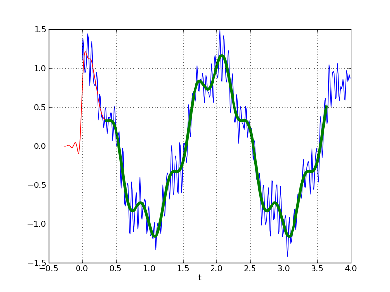
plot(t-delay, filtered_x, 'r-')
# Plot just the "good" part of the filtered signal. The first N-1
# samples are "corrupted" by the initial conditions.
plot(t[N-1:]-delay, filtered_x[N-1:], 'g', linewidth=4)
xlabel('t')
grid(True)
show()


The final plots shows the original signal (thin blue line), the filtered signal (shifted by the appropriate phase delay to align with the original signal; thin red line), and the "good" part of the filtered signal (heavy green line). The "good part" is the part of the signal that is not affected by the initial conditions.
Section author: WarrenWeckesser
Attachments