Matplotlib: bar charts
| Date: | 2008-01-03 (last modified), 2006-08-09 (created) |
|---|
Use the bar function to make bar charts: http://matplotlib.sourceforge.net/matplotlib.pylab.html#-bar
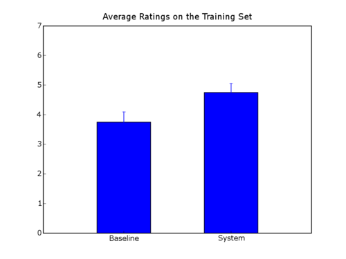
Here's an example script that makes a bar char with error bars and labels centered under the bars.
In [2]:
#!/usr/bin/env python
import numpy as na

from matplotlib.pyplot import *

labels = ["Baseline", "System"]
data =   [3.75               , 4.75]
error =  [0.3497             , 0.3108]

xlocations = na.array(range(len(data)))+0.5
width = 0.5
bar(xlocations, data, yerr=error, width=width)
yticks(range(0, 8))
xticks(xlocations+ width/2, labels)
xlim(0, xlocations[-1]+width*2)
title("Average Ratings on the Training Set")
gca().get_xaxis().tick_bottom()
gca().get_yaxis().tick_left()

show()

Section author: Unknown[74], GaelVaroquaux, Unknown[87]
Attachments